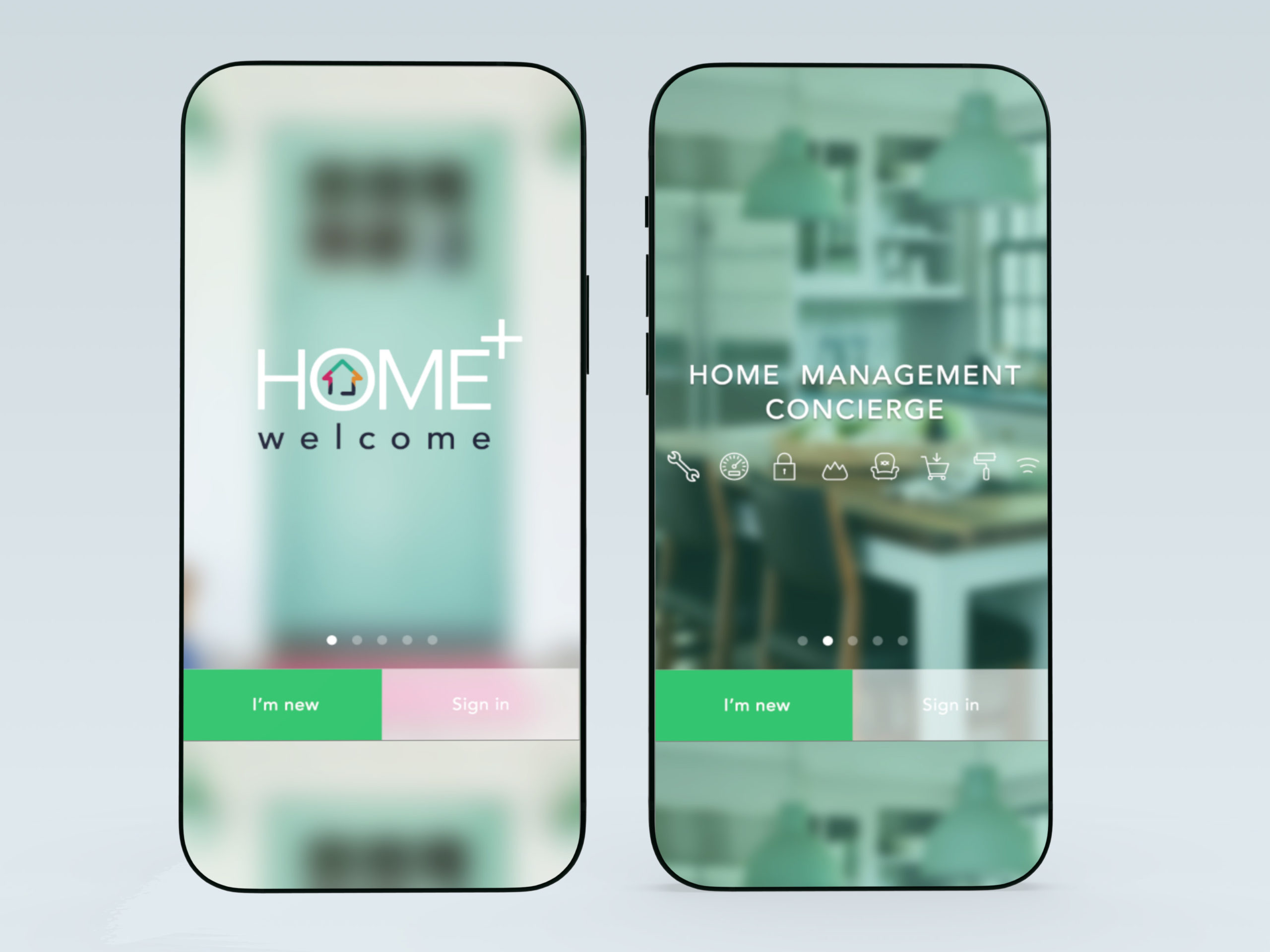
Home+
A social platform for neighbor engagement, that allows users to automate their homes in zones and scenes. The app encourages neighbors to refer contractors and coordinate group home services for better deals. It’s the app every smart neighborhood needs!
The project employs a straightforward visual interface for organizing household items and assigning relevant details, including data obtained via barcode scanning. It actively manages these items, utilizing your location to incorporate seasonal and weather-specific tasks.
There’s a social element where friends and nearby neighbors provide referrals, ensuring impartial ratings. Service professionals seamlessly engage with embedded information, from bidding to payment. It’s presently accessible on iOS and web platforms.
Future updates will introduce a distinctive micro-insurance function and tiered access for managed and on-demand housing owners.

Project Overview:
Led the entire UX/UI production of Home+, a smart home management app that enables users to manage their smart devices by zones and scenes. This app aims to facilitate neighbor referrals, allowing users to organize and crowdfund home services.
Background:
Home+ is a project founded by Gordon Ebanks, a serial entrepreneur, and Andrew Reiniak, an architect. They hired me to lay out and simplify, into an elegant and functional design, the idea of the above-described app. Home+ aims to simplify common pain points for a fluid, automated home experience.
Users:
The app is designed for homeowners as primary users.
Research:
As someone who lives in a neighborhood, it was easy to ask around and even gather my own user experience.
Pain points include:
- Repeated contractor contacts in the group chat that get lost and people ask for them again.
- Many automatic home-devices with no single place to manage them visually.
- Different users with different tastes inside home.
Information architecture and flowchart
- Designed the app’s information architecture to enhance navigation.
- Proposed a unified branding UI kit with peaceful and calm color palette.
- Designed interactive elements such as the appliances tag on top of the picture. Visualizing these appliances on a picture instead of a list, made it easier to control and improved user experience.
Wireframes and low fidelity mockups
- Narrowed all the complex functionality into a simple visual layout.
- Worked on first user-flow.
- Low fidelity UI, high fidelity UX.
Design process
“After wireframes and low-fi mockup approval, I went ahead and implemented branding and UI. Many corrections, user-testing, and iterations still happen, but with the right organization and with the help of a UI Branding kit, updating the design is a breeze”
Implementation Phase
- Developed interactive prototypes using Creative Suite.
- Collaborated with developers and stakeholders to implement redesigned features, ensuring device compatibility.
- Conducted rigorous quality assurance testing to address bugs.
“Favorite design choice: Proposed a dynamic and very personal interface. Background changes depending on sunlight, each zone, scene, and house user has personalized avatars.“
Onboarding and registration
Creating zones and adding appliances
Dashboard and other functionalities
Evaluation Phase
- Conducted usability testing with homeowners, neighbors, and service providers
- Monitored key metrics such as user engagement.
- Gathered feedback from users through surveys and in-app forms.
- The app has evolved into Oaklo.


