MedMatch
An AI-powered platform for patient engagement, coordination of care, and interoperability. 8.9 K customers reviews + 19.9 K physician reviews + 2022 Patient Choice Award.
MedMatch is an app that allows doctors to manage referrals. Doctors have an active dashboard with internal networking messages, where they can keep track, send or receive medical information, and be always on top of their referrals. Doctors are individually rated for their services, so it’s easier to know who to refer to.
I designed the entire brand, concept, architecture, UX and UI.

Project Overview:
Led the entire UX/UI production of Medmatch, a B2B doctor referral app aimed at facilitating seamless patient referrals between medical practices, improving doctor ratings and feedback mechanisms, and fostering referral partnerships.
Background:
- Medmatch, is a brand new project and doesn’t have user history, we will be monitoring usability challenges by user feedback and usage data.
- Medmatch aims to simplify common pain points including manual inefficient patient referrals, feedback processes, and partnership establishment.
Users:
- The app is designed with doctors and medical assistants as the primary users, featuring a simple and clean medical aesthetic.
Research:
- Conducted user interviews with doctors, medical assistants, and practice managers to understand their needs and pain points. Most referrals are made manually and there’s no track of them besides a patient note or the result on the doctor’s computer.
- Performed competitive analysis of similar B2B medical apps to identify features and best practices.
- Conducted usability testing sessions with current users to identify areas of friction.
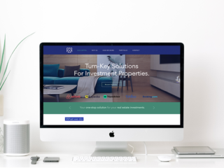
Landing page and onboarding
Design process
“During the process, I always show the client a general information architecture so we can estimate hours, deadlines, and product timelines. Once the client agrees, I express this in a more detailed flowchart and we start refining it from there.”
Information architecture and user-flow
- Designed the app’s information architecture to enhance navigation.
- Proposed a unified branding UI kit with a focus on a clean medical aesthetic. Main color palette ranges from teal to green, but accent icons and messages in basic tones such as orange and red.
- Designed interactive elements such as the main progress bar, message modals and rating widgets to improve user experience.
- Iterated various designs for the progress bar, it was very important to show the user the steps to complete the referral.
- Fun fact: Client had a vision that I had to implement with no negotiation, on the dashboard he wanted a big large action call button. I had to work around that request to make match cohesively with the clean interface.
Implementation Phase
- Developed interactive prototypes using Creative Suite.
- Collaborated with developers and stakeholders to implement redesigned features, ensuring device compatibility.
- Conducted rigorous quality assurance testing to address bugs.
“I truly enjoy the branding and UI of each project, the color palette selection, and the intricate details of each icon. Here’s an example of some UI components that were used on the project.”
Evaluation Phase
- Conducted usability testing with doctors, medical assistants, and practice managers.
- Monitored key metrics such as referral completion rates and user engagement.
- Gathered feedback from users through surveys and in-app forms.
- The app received positive feedback from medical professionals, with significant improvements in usability, visual design, and functionality.
- Key metrics, including referral completion rates and user engagement, showed notable enhancements, indicating a successful enhancement of the user experience.
- The app has become a trusted tool for doctors and medical assistants, contributing to improved collaboration and patient care across medical practices.
- It’s continuing to evolve, as we need to keep learning from our users.