Lujo by Baroque Access
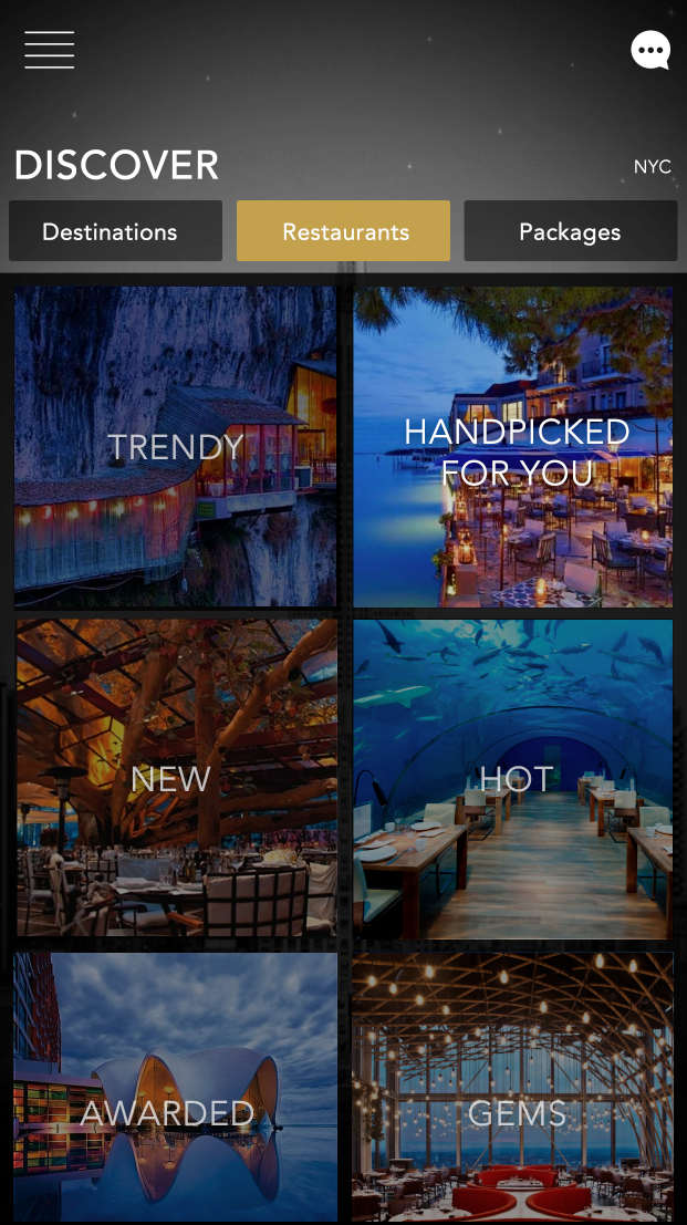
Concierge for luxury tourism in various areas including aviation, villas, activities, cars, restaurants, etc. We designed the website and mobile app for this company. The overall design had to express luxury and be as user-friendly as possible.
Lujo represents a cutting-edge service that redefines membership-based concierge services for the digital age. This innovative platform seamlessly integrates advanced technology with personalized attention to simplify the lives of discerning individuals.

Project Overview:
Concept, branding, architecture and UX/UI production of Lujo.
Background:
As the brainchild of Baroque Access a private club membership that provides its members with portals to enjoy infinite possibilities of fine experiences in travel, retail luxury goods, and jewelry.
Lujo is a personalized aide-de-camp, leveraging state-of-the-art technology to understand user preferences and requirements. Through its intuitive interface, the app meticulously curates recommendations tailored to specific needs, whether it’s securing reservations at distinguished establishments or orchestrating memorable experiences.
What sets Lujo apart is its commitment to holistic enhancement. The application aims to elevate every aspect of the user experience, from tailored suggestions to prompt assistance, enriching daily life in meaningful ways.
With Lujo, users can streamline their lives and focus on what truly matters, making it an invaluable addition to any portfolio of innovative projects.
Users:
High end individuals that like to travel and shop. They love a luxury lifestyle and money is not a limitation.
Research:
- Users don’t want to be in contact with a human concierge, they want everything right away and at the touch of a button.
- Users want to enjoy the experience and not have to deal with organizing it, or the troubles that sometimes comes with cancelations or rescheduling.
- Scheduling and organizing unique experiences can be challenging.
- Different users with different tastes inside home.
Design Implementation Phase
First design proposal
- Client provided initial information architecture.
- Proposed a unified branding UI, with elegant colors that reflect luxury.
- Bold search bar and action call to make a new reservation.
- Navigation bar with filters to facilitate search.
Things to update:
- Aesthetic had to be more elegant
- Changed the background and branding colors.
- Client changed Baroque name for Lujo.
Onboarding and registration
Make a new search
“This app had to feel like a very exclusive gem. Only certain people had access to this type of service, and the client asked for something spectacular”
- Narrowed all the complex functionality into a simple visual layout.
- Worked on first user flow.
- Developed interactive prototypes using Creative Suite.
- Collaborated with developers and stakeholders to implement redesigned features, ensuring device compatibility.
- Conducted rigorous quality assurance testing to address bugs.

